Thursday, August 12, 2010

Designer Furniture & Wallpapers & Thomas Hardy


An Example of Florence Broadhurst Wallpaper

It is an exciting time for design in Australia there is a lot going on. An Australian/Japanese furniture designer’s brilliant work was featured on the Art Nation show. His work is just divine. Khai Liew has created seating for the Art Gallery of South Australia and he made some interesting comments into his philosphy of design.

Furniture designer Khai Liew’s work

You can be inspired by the wonderful work of Khai on this video. This lovely man also shares his philosophy on design. It is well worth a look.

Khai uses oriental joins to make elegant simple furniture

He uses historical ideas as a reference for his designs but used contemporary thinking. He often uses oriental joints to make elegant, timeless pieces. Liew thinks designers should go with their intuition and believes simplicity is a key of good design. He states we should use old methods of construction in new ways. The aim of design should be to enrich people’s lives. 

For a brilliant example of an oriental joint follow this link http://www.woodworkersinstitute.com/page.asp?p=809

Wallpaper very much in vogue

Wallpaper continues to grow in popularity. During the 1980’s and 1990’s wallpaper went out of fashion. This was mainly due to open plan living. There was less wall space for wallpaper. The Historic Houses Trust of Australia has a reference library of wallpaper dating from the 1840’s. Flowers and botanic items have always been used for inspiration for patterns this influence goes back to ancient Greece.     

Australians had a love affair with wallpaper in 1800’s

In the 1800’s England was the largest producer of wallpaper in the world. Australians were the largest imports of the wallpaper. Wallpaper can tell the story of how Australians have lived.
Australia was a rich nation in the late 19th century. The Australians regularly re decorated their houses in order to; keep up with the Jones.   

Fabulous Florence Broadhurst wallpaper designs rule again

There has been an incredible resurgence of interest and use of the wallpapers of Florence Broadhurst. Her wallpapers are brilliant in colour and bold in design. There is still a huge archive of her work still being discovered. Her wallpapers have become a phenomena around the world.

Collections of famous designer wallpapers available

Porters Paints have an awesome collection of wallpaper designs by leading designers. Product and Costume Designer for film and theatre Catherine Martin, Fashion and Costume Designer Bowie Wong, and Julie Paterson from Cloth have created collections for Porters Paints. They certainly have the wow factor. Old English styles of wallpaper have also been re released.

If you follow this link you can see some of the wonderful wallpapers mentioned above

The great writer Thomas Hardy built his own house 


During the week I also read the biography of Thomas Hardy. As I have mentioned before I love reading about the lives of my favourite writers. I am amazed at how many have written pieces on decorating, design and architecture. Thomas’ first published work was ‘How I Built Myself a House’ published in 1865 in the Chamber’s Journal. He also wrote a note book on architecture. It was published as ‘The Architectural Notebook of Thomas Hardy’ in 1966 by C.J.P. Beatty.

Hardy's House Max Gate

Hardy started work his working life with an architect


I must admit I was a little disappointed with this his first work. He started work with an architect long before he began to write. I expected some gems of wisdom instead he appears to have gleaned little knowledge of the subject.

Thomas wants his new house to be of mysterious size and proportions

He wanted his new house to be right and proper of mysterious size and proportion (whatever that means). Hardy wanted his house to cost neither too little or too much. He wanted it situated in a healthy spot, on a subsoil of dry gravel, 90 feet above the springs with the trees to the north, a pretty view to the south and easily accessible to the rail.    

19th Century land developed viewed at railway stations

It is interesting to note coloured plans of ‘Land to be let for Building Purposes’ where available for viewing at railway stations and in agents’ windows. After viewing these plans he had to give up his desire for the trees, the 90 feet above the springs and the gravel subsoil.

Hardy and his wife made some sketches of a proposed floor plan and consulted with an architect. Mr. Penney the architect informed them of the sizes of the rooms that would be possible. He was even able to advise them on how many cases of wine to order to fit into the wine-cellar.

Building cost of sixpence a foot quoted

The couple seemed to be overwhelmed by the architect’s opinions and facts. They wanted to spend no more than eight thousand pounds. Mr. Penny quoted sixpence a foot. As they were leaving Mrs. Hardy reminded the architect she wanted a nice conservatory in the Chinese style.

When the Hardy’s visited the site to check on the foundations they thought the house looked too small. Oh how many people have thought the same? Mrs. Hardy had them change the dimensions of the drawing room to make it bigger. Hundreds of pounds worth of additions were added to the original plan. Hardy was unaware of the rising costs these changes would make.

Thomas Hardy’s first recorded published item

The couple seemed to have had the same experience most people have when building their own home. I suppose I expected more of Hardy. If you would like to read the article you can do so by visiting:  Thomas's first recorded published item at http://neal.oxborrow.net/Thomas_Hardy/Howibuiltmyhouse.htm

Thomas goes on to write brilliant novels and poems, becoming a legend in his own life time


Hardy went on to write a number of brilliant books, The Return of the Native, Far from the Madding Crowd, Tess of the d’Urbervilles (my favourite) and Jude the Obscure among others. He was also a talented poet.       

“Good business leaders create a vision,
articulate the vision,
passionately own the vision, and
relentlessly drive it to completion.”

Thomas Hardy
Enhanced by Zemanta

Tuesday, August 10, 2010

Scottish Colourists and Anne Redpath

The poppy Field, circa 1963, Tate Gallery. A t...Image via Wikipedia


Problems can lead us to treasures. Our central heating decided to have a holiday this week right in the middle of winter. Staying warm was a problem. I was grateful for a coat my sister in law gave me. She purchased the coat in Northern Italy. I can only describe it as like wearing a feather doona. So I spent my time staying warm and I had a great time watching the ‘Palin on Art ‘ DVD and I also watched the brilliant Art Nation TV show on the ABC.


The Scottish Colourists

When I first started to paint my favourite subject was still-lifes. It was therefore no surprise my favourite paintings from the Palin DVD were the still-lifes. The wonderful work of the Scottish Colourists and Anne Redpath are featured on the DVD. The colourists were a group of artists who had an influence on and were influenced by the French Impressionist and Fauvists of the early 1900’s.

The used brilliant colour and wild brush strokes

John Ferguson, Lesley Hunter, F. C. B Cadell and Samuel John Peploe exhibited their work in Paris in 1907 and became known as The Modern Scottish Painters. They used vibrant colours and wild brush strokes. Their work was considered elegant and sophisticated in France. But the British found their work shocking. They spend a lot of time in France painting. When the First World War broke out they returned to Britain. John, Lesley, Frances and Beverly produced some of Britain’s greatest works. They have often been over looked and their influence underrated. Their paintings are now worth a lot of money. The images I have used here are from the Bridgeman Art on Demand website. The posters are available at www.bridgemanartondemand.com they have a range of works by this group of artists.


Some links to examples of the Scottish Colourists works

John Fergusson


F.C.B Cadell and more information on the Scottish Colourists http://www.exploreart.co.uk/artistic_styles_details.asp?ArtistID=11&ArtisticStyleID=4

Anne Redpath

Anne Redpath (1895 – 1965) was another Scottish artist who spent time in France. It is interesting to note she did very little painting during this time. Her time was taken up being a wife of an architect and a mother of three boys. When asked about this later in her life she said she never regretted doing so.

Anne was one of the most respected artists of her generation

She did create brief impressions and complied notes of the scenes she observed in France. When her children were older she launched herself into a life of painting. She became one of the most respected artists of her generation. My favourite painting of Anne’s is ‘The Poppy Field’ Peploe’s ‘Tulips’ and I love Cadell’s ‘The Vase of Water’


My favourite ‘The Field of Poppies’
http://www.tate.org.uk/servlet/ViewWork?cgroupid=999999961&workid=12343&searchid=9755

Anne painted still-lifes, Scottish landscapes and Mediterranean scenes

Until the 1950’s Anne painted Still-Lifes and Scottish landscapes. After this time she painted scenes from Mediterranean life. Abstract painting has been the main focus of my art for over twenty years. But I feel an urge to go back to my first love and try some still-lifes.

Like always I have gotten carried way looking for and viewing examples of the work of this wonderful group of artists so I have run out of time and will talk about the gems found on the Art Nation show in the next blog.
  
Enhanced by Zemanta

Saturday, August 7, 2010

Starck's Design for Life Continues

Poul Henningsens PH-Lampe von 1925Image via Wikipedia
Famous product designer Starck continues his journey to find the best young creative talent in Britain. As I watched this episode I was amazed to discover I had missed an episode. The weeks go by so quickly. Apparently in the last episode Starck nearly eliminated all the contestants.


The budding product designers had badly underestimated the real design task set by Starck. He complained they presented vague notions and confused concepts. He wanted clearly defined ideas with technical drawings. All the students appeared upset and angry some making statements like ‘His is only one man’s opinion’ ‘He does not clearly explain what he wants’ ‘His feedback on our design proposals was in adequate’


I remember one of my first bosses being similar to Starck. I was sixteen and working in a big dental practice. I planned to work as a dental nurse until I was old enough to get into nursing at the age of eighteen. As a junior dental nurse I worked in surgery one with the head nurse. Unfortunately the senior nurse left a few weeks after I started work. This was not an unusual occurrence, in this dental practice nurses who worked in surgery one did not last long. I was left on my own with a nightmare of a boss.


Like Starck he had high expectations, yet did not clearly express his requirements. The nurse was expected to know what he wanted without him saying a word. I learnt a great deal from this experience. Each night I went home with the patient list with the each required treatment noted. Using the dental nurse’s handbook I worked out the instruments and materials required for each treatment. I also talked with his former nurses who explained how he liked things done. With fear and trembling I started each day early. I set up the surgery treatment trays got all the materials ready and had lists of each procedure written out ready to view.


Fear can be a great motivator. I had to learn to sink or swim and very quickly. To the amazement of the boss (and myself I might add) I swam very well. He ended up having great respect for me and would make comments like “I expect my nurses to be two steps ahead of me, but see this little thing she is ten steps ahead of me”


Hard work, showing initiative and going the extra mile will always bring positive results. Strack had the same effect on the student designers as my boss had on me. They rose to the challenge when they were given a second chance with the design brief.


Four designs have been selected to be created as proto types. Unfortunately four students were sent home.
Enhanced by Zemanta

Tuesday, August 3, 2010

The Stylish 1950’s and Swinging 1960’s can be created using Sample Board Online supplier base


From the Article: How to interior design in a retro style: Stylish 1950’s or Swinging 1960’s
To design in a retro style is to remix aspects of a previous style.  Many styles of the past have successfully been reinvented time and time again. A popular retro style is the style created in the 1950’s rock ‘n’ rock era. The 1960’s became known as the swinging 60’s. Interior décor and clothing fashions can be intermingle to create bold trendy statements.


SAS Royal Hotel Denmark 1958

Designed by Arne Jacobsen 

Featuring his famous Egg Chair


Some 1950's Colours


Hot Pink
Turquoise
King Fisher Blue


If you would like to create a 1950’s look hot pink was the colour of the decade. Italian couture began to rival French couture. Pucci and Simonetta were influenced by the colours of the Renaissance. Fath used Honan silks in hot pink. Turquoise became a sensation after 1951. The Germany Company Bayer developed the first colour fast turquoise dye Alcian. Full skirts in bold colours were a hallmark of the rock ‘n’ roll era …. To read more….  http://www.articlesbase.com/interior-design-articles/how-to-interior-design-in-a-retro-style-stylish-50s-or-swinging-60s-2944719.html

If you have followed the link from the article you will find some images in this blog from these eras.


During the 50’s and 60’s the International Style also continued to have impact on the design scene. Many of the classic furniture designs created at this time are now available, being replicated or used as a source of inspiration for contemporary design.

SAS Royal Hotel Denmark 

Interior Design by Arne Jacobsen

Featuring his Egg Chair


Some 1960's Colours


Examples are the Egg Chair designed by Arne Jacobsen, the Ant chair and the Eames chair and ottoman. You can find suppliers of these designer items on the Sample Board Online site.


Sample Boards Created on Sample Board Online

Featuring Classic Modern Furniture


Enhanced by Zemanta

Wednesday, July 28, 2010

Hints & Tints: Interior Decoration with Colour Images and Article Link

In this blog you will find the images I promised for those of you who have followed the link from the article ‘Hints and Tints Interior Decorating with Colour’


The images selected illustrate the points on colour discussed in the article. Images of the rooms are shown one with tinted light, cool colours showing how the colours make the rooms appear bigger due to the fact light/cool colours appear to recede.


In the second group of images the same rooms now have a mid colour. In the third group the warmer darker colours appear to advance into the rooms. The colours can make the rooms appear smaller and more intimate.


Tip: Sometimes it helps if you half close your eyes as you view the images


Many people consider colour the most important of the interior design elements. Colour can create moods, make a room appear bigger or make a room appear colder or warmer. It is a powerful interior decorating tool.


As stated in the article colours are basically light or dark, warm or cool. Light and cool colours tend to recede (when used on the walls of a room they can make the walls appear to move out) and can make a room appear bigger. Dark and warm colours appear to advance into a room and can make a room appear smaller.


You need to consider three many things when selecting colour, first is the aspect of the room. The second consideration is your personal preference and the third size and shape of the room.

If a room is large warm or dark colours can make it appear smaller. If the room is very long and narrow the short walls can be painted in a darker or warmer colour than the colour used on the longer walls. This will make to shorter walls appear to advance into the room in comparison to the longer walls, making the room appear shorter and wider.

If you would like to view the whole article just click on this link http://www.articlesbase.com/interior-design-articles/hints-with-tints-interior-decoration-with-colour-2636737.html


Louis Cheskin a market research pioneer and

founder of Cheskin Research states


‘The right colours are silent music:

the wrong colours irritate and disturb’
Enhanced by Zemanta

Saturday, July 24, 2010

Wash lamp, health & humour, awards and Quantum's acoustic delights

In this blog you will find the links and some images as I promised in the Sample Board Online July newsletter

The Wash Lamp

As mentioned in the July newsletter Alex Kovatchev has generated a great buzz with her ‘Wash Lamp’ exhibited at the European Lighting Fair in Frankfurt. The exciting eco friendly lamps designed by Alex are created from washing machine drums. That’s the part we wash our clothes in what a brilliant way to use recycled parts.


Humour keeps us healthy

If you have had trouble with the link to the ‘The Science Daily’ article in the newsletter on how a sense of humour helps keep people healthy and increases their chances of reaching retirement age. You can use the link below. The article quoting a study conducted by the University Of Science & Technology (NTNU) in Norway as a source can be found here http://www.sciencedaily.com/releases/2010/06/100604073717.htm


Tale of Two Brains

I am sure you would enjoy the hilarious youtube video The Tale of Two Brains by Mark Gunger. He explains how male and female brains are different. It is well worth checking out this video. I always think it is worthwhile adding to our understanding of the human brain. This sort of knowledge can be helpful to us in our personal and professional life. Hope you enjoy the video.    

International Restaurant & Bar Design Awards

The overall winner for best restaurant design is the ‘Galvin La Chapelle’ in London designed by designLSM. The best bar award was awarded to ‘The Tote’ in India designed by Serie Architects. You can find images and details of all the winners on the restaurant and bar design awards website.

The Victorian 2010 Premier’s Design Award winners

The State of Design Festival was a great success. I am slowly going through my discoveries. I spent two wonderful days in Melbourne. The winners of the design awards are listed below and you can find images on the website http://www.stateofdesign.com.au/Premiers-Design-Awards/page-2010-Winners
  • Python Underground Processing Plant
  • The Golden Age of Couture Exhibition (I visited the exhibition it was brilliantly designed)
  • Stephanie Alexander Kitchen Garden Program
  • Eastlink (Urban Design) - ConnectEast,
  • Whizkids, the National eTherapy Centre and Swinburne University of Technology

SBO supplier Quantum’s Acoustic Delights                                                                                                                                                                                                                                                                   

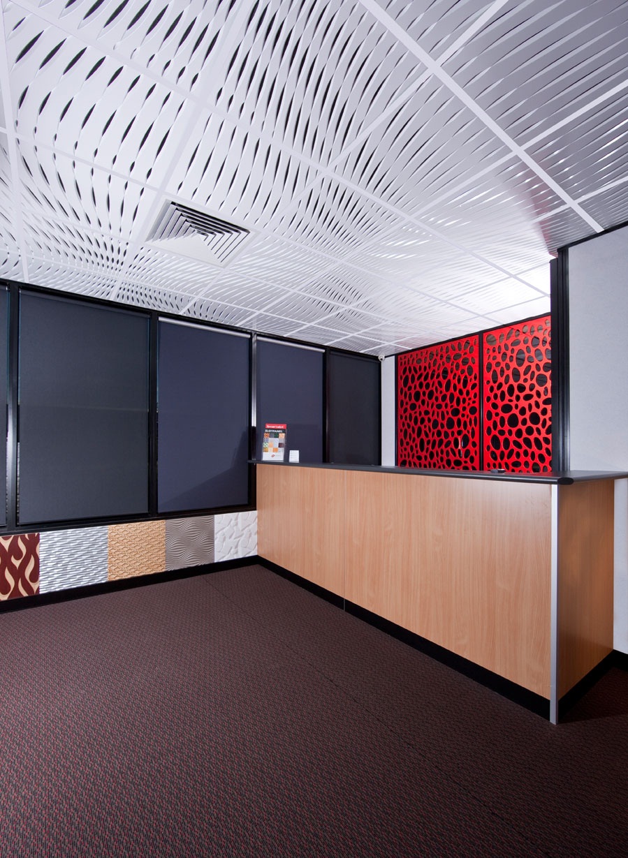
I have added some images of some funky new Quantum Innovation products; they have added acoustic panels to the Graphic Illusion range. I will do a more detailed blog on the products soon. To give you a taste of what is to come.  


Sunday, July 18, 2010

State of Design Festival


I spent some time this week in Melbourne at the Decoration + Design, Furnitex and Design:Made:Trade expo. Talked with some great suppliers and designers and gathered tons of information on new products. I will enjoy spending next week going through my finds.


The Design:Made:Trade expo was excellent. The booths were made out of recycled cardboard. Some of the booths looked like funky igloos. Cardboard stools and tables were available for visitors to rest and have a cup of coffee. 

The cardboard stools reminded me of a sculpture project I did when I was studying art. The project brief stated we had to create a sculpture from paper. The sculpture had to be strong enough to stand on. We were only allowed to use paper and glue. This seemed an impossible task to most of us.
My fellow students came up with some brilliant designs. My sculpture turned out really well and I achieved top marks for this project I surprised myself. It is amazing how strong paper and cardboard can be. Unfortunately I lost the sculpture in one of our many house moves. But seeing the wonderful cardboard structures at the design expo brought it all back into my mind. Maybe I could use the sculpture idea to create an eco friendly stool of my own. It’s an interesting idea.
       
When we visit Melbourne we usually go to Lygon Street. This time we found a terrific restaurant zone within walking distance of our apartment. It was delightful to find this gem in Hardware Lane. Melbourne is a great city, with brilliant food and wonderful people.  

The Victorian State of Design Festival certainly had the city buzzing. The theme for this year Change by Design. The focus; on three key themes, the built environment, mobility systems and digital strategies. Events are being held throughout the state. The Design for Everyone program has free design events including Melbourne Open House, Vision Broadmeadows 2030 and the Anno Student Design Comp. Unfortunately two days did not allow enough time to do justice to the treasures on offer. Next year I will try to plan a longer visit.


One of the highlights of the festival will be the announcement of the Premier’s Design Awards on the 21st July. My favorite designs in the running are the Fitzroy High School and the Bendigo Centre. If you are interested in looking at some of the finalists see the links below.       


‘Good design can deliver economic, 
social and environment value 
by improving living conditions, 
generating innovative products and 
services and creating sustainable 
development opportunities’
Gavin Jennings Victorian Minister for Innovation (Sunday Hearld 11th July 2010)

Tuesday, July 13, 2010

Starck's Design for Life Continues

Watched the second episode of Design for Life and found it very interesting. I find it amusing Starck refers to his Paris design team as the tribe. I totally agree with his design philosophy with regard to the idea; design should be democratic. 

Good design should not be created for and available to only those who can afford it. It should not be elitist everyone is entitled to good design. This has been my philosophy from the beginning of my design career.


Starck sees himself as a bottle opener of the mind. His accent is difficult to understand at times so I don’t always grasp what he is saying. He again mentioned the effects of product design on every aspect of life. He believes designers should design to help humanity to help others achieve full potential.


Seen in this light being a designer can be awesome responsibility. The design brief he presented to the students was certainly very wide open and appeared to overwhelm many of the students.   


To be honest I was glad to see Nebil leave, his over confident attitude really annoyed me. Polly came up with the brilliant idea of placing a water meter in each British home. She seemed to be the only one to grasp what Starck wanted; to find a problem then design a product to overcome the problem and in turn benefit humanity. 
 
Philippe did find what he thought the laziness of the students frustrating. He wants them to push ideas to the limit. For example Rob’s idea of placing buildings on the sea instead of land remained only an idea. He did not develop the idea and design the buildings to be built on the sea. This was an opportunity to create something completely new.    

"All fine architectural values 
are human values, 
else not valuable "

Frank Lloyd Wright