Wednesday, July 28, 2010

Hints & Tints: Interior Decoration with Colour Images and Article Link

In this blog you will find the images I promised for those of you who have followed the link from the article ‘Hints and Tints Interior Decorating with Colour’


The images selected illustrate the points on colour discussed in the article. Images of the rooms are shown one with tinted light, cool colours showing how the colours make the rooms appear bigger due to the fact light/cool colours appear to recede.


In the second group of images the same rooms now have a mid colour. In the third group the warmer darker colours appear to advance into the rooms. The colours can make the rooms appear smaller and more intimate.


Tip: Sometimes it helps if you half close your eyes as you view the images


Many people consider colour the most important of the interior design elements. Colour can create moods, make a room appear bigger or make a room appear colder or warmer. It is a powerful interior decorating tool.


As stated in the article colours are basically light or dark, warm or cool. Light and cool colours tend to recede (when used on the walls of a room they can make the walls appear to move out) and can make a room appear bigger. Dark and warm colours appear to advance into a room and can make a room appear smaller.


You need to consider three many things when selecting colour, first is the aspect of the room. The second consideration is your personal preference and the third size and shape of the room.

If a room is large warm or dark colours can make it appear smaller. If the room is very long and narrow the short walls can be painted in a darker or warmer colour than the colour used on the longer walls. This will make to shorter walls appear to advance into the room in comparison to the longer walls, making the room appear shorter and wider.

If you would like to view the whole article just click on this link http://www.articlesbase.com/interior-design-articles/hints-with-tints-interior-decoration-with-colour-2636737.html


Louis Cheskin a market research pioneer and

founder of Cheskin Research states


‘The right colours are silent music:

the wrong colours irritate and disturb’
Enhanced by Zemanta

Saturday, July 24, 2010

Wash lamp, health & humour, awards and Quantum's acoustic delights

In this blog you will find the links and some images as I promised in the Sample Board Online July newsletter

The Wash Lamp

As mentioned in the July newsletter Alex Kovatchev has generated a great buzz with her ‘Wash Lamp’ exhibited at the European Lighting Fair in Frankfurt. The exciting eco friendly lamps designed by Alex are created from washing machine drums. That’s the part we wash our clothes in what a brilliant way to use recycled parts.


Humour keeps us healthy

If you have had trouble with the link to the ‘The Science Daily’ article in the newsletter on how a sense of humour helps keep people healthy and increases their chances of reaching retirement age. You can use the link below. The article quoting a study conducted by the University Of Science & Technology (NTNU) in Norway as a source can be found here http://www.sciencedaily.com/releases/2010/06/100604073717.htm


Tale of Two Brains

I am sure you would enjoy the hilarious youtube video The Tale of Two Brains by Mark Gunger. He explains how male and female brains are different. It is well worth checking out this video. I always think it is worthwhile adding to our understanding of the human brain. This sort of knowledge can be helpful to us in our personal and professional life. Hope you enjoy the video.    

International Restaurant & Bar Design Awards

The overall winner for best restaurant design is the ‘Galvin La Chapelle’ in London designed by designLSM. The best bar award was awarded to ‘The Tote’ in India designed by Serie Architects. You can find images and details of all the winners on the restaurant and bar design awards website.

The Victorian 2010 Premier’s Design Award winners

The State of Design Festival was a great success. I am slowly going through my discoveries. I spent two wonderful days in Melbourne. The winners of the design awards are listed below and you can find images on the website http://www.stateofdesign.com.au/Premiers-Design-Awards/page-2010-Winners
  • Python Underground Processing Plant
  • The Golden Age of Couture Exhibition (I visited the exhibition it was brilliantly designed)
  • Stephanie Alexander Kitchen Garden Program
  • Eastlink (Urban Design) - ConnectEast,
  • Whizkids, the National eTherapy Centre and Swinburne University of Technology

SBO supplier Quantum’s Acoustic Delights                                                                                                                                                                                                                                                                   

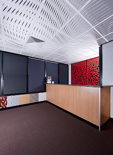
I have added some images of some funky new Quantum Innovation products; they have added acoustic panels to the Graphic Illusion range. I will do a more detailed blog on the products soon. To give you a taste of what is to come.  


Sunday, July 18, 2010

State of Design Festival


I spent some time this week in Melbourne at the Decoration + Design, Furnitex and Design:Made:Trade expo. Talked with some great suppliers and designers and gathered tons of information on new products. I will enjoy spending next week going through my finds.


The Design:Made:Trade expo was excellent. The booths were made out of recycled cardboard. Some of the booths looked like funky igloos. Cardboard stools and tables were available for visitors to rest and have a cup of coffee. 

The cardboard stools reminded me of a sculpture project I did when I was studying art. The project brief stated we had to create a sculpture from paper. The sculpture had to be strong enough to stand on. We were only allowed to use paper and glue. This seemed an impossible task to most of us.
My fellow students came up with some brilliant designs. My sculpture turned out really well and I achieved top marks for this project I surprised myself. It is amazing how strong paper and cardboard can be. Unfortunately I lost the sculpture in one of our many house moves. But seeing the wonderful cardboard structures at the design expo brought it all back into my mind. Maybe I could use the sculpture idea to create an eco friendly stool of my own. It’s an interesting idea.
       
When we visit Melbourne we usually go to Lygon Street. This time we found a terrific restaurant zone within walking distance of our apartment. It was delightful to find this gem in Hardware Lane. Melbourne is a great city, with brilliant food and wonderful people.  

The Victorian State of Design Festival certainly had the city buzzing. The theme for this year Change by Design. The focus; on three key themes, the built environment, mobility systems and digital strategies. Events are being held throughout the state. The Design for Everyone program has free design events including Melbourne Open House, Vision Broadmeadows 2030 and the Anno Student Design Comp. Unfortunately two days did not allow enough time to do justice to the treasures on offer. Next year I will try to plan a longer visit.


One of the highlights of the festival will be the announcement of the Premier’s Design Awards on the 21st July. My favorite designs in the running are the Fitzroy High School and the Bendigo Centre. If you are interested in looking at some of the finalists see the links below.       


‘Good design can deliver economic, 
social and environment value 
by improving living conditions, 
generating innovative products and 
services and creating sustainable 
development opportunities’
Gavin Jennings Victorian Minister for Innovation (Sunday Hearld 11th July 2010)

Tuesday, July 13, 2010

Starck's Design for Life Continues

Watched the second episode of Design for Life and found it very interesting. I find it amusing Starck refers to his Paris design team as the tribe. I totally agree with his design philosophy with regard to the idea; design should be democratic. 

Good design should not be created for and available to only those who can afford it. It should not be elitist everyone is entitled to good design. This has been my philosophy from the beginning of my design career.


Starck sees himself as a bottle opener of the mind. His accent is difficult to understand at times so I don’t always grasp what he is saying. He again mentioned the effects of product design on every aspect of life. He believes designers should design to help humanity to help others achieve full potential.


Seen in this light being a designer can be awesome responsibility. The design brief he presented to the students was certainly very wide open and appeared to overwhelm many of the students.   


To be honest I was glad to see Nebil leave, his over confident attitude really annoyed me. Polly came up with the brilliant idea of placing a water meter in each British home. She seemed to be the only one to grasp what Starck wanted; to find a problem then design a product to overcome the problem and in turn benefit humanity. 
 
Philippe did find what he thought the laziness of the students frustrating. He wants them to push ideas to the limit. For example Rob’s idea of placing buildings on the sea instead of land remained only an idea. He did not develop the idea and design the buildings to be built on the sea. This was an opportunity to create something completely new.    

"All fine architectural values 
are human values, 
else not valuable "

Frank Lloyd Wright

Monday, July 12, 2010

The Decoration of Houses by Edith & Ogden

As part of my reading plan I often read biographies of writers. I like to find out how writers planned their writing, when they started to write, where they lived and who they knew. Also what it was like to live in the era in which they lived. I find this fascinating.  


During this past few months I have read two very interesting biographies; one on the life of Edith Wharton and one on the Duchess of Newcastle both female writers. Edith Wharton is most famous for her novels. However her first book was ‘The Decoration of Houses’ written in 1897 with the architect Ogden Codman Jr.  


It is interesting as I returned to the subject of Art Nouveau and Art Deco I was reading the life story of Edith who lived in the US and France in this very era. As I wrote about these eras I was again stuck by how the influence of new styles slowly gain acceptance. We can sometimes look at periods of design history in isolation forgetting they are only part of a bigger picture.

Ogden and Edith’s decorating book was very influential. Edith believed rooms should be simple in design, be symmetrical with classic proportions. The book was a great success and is important to us in the design profession. It led to the emergence of professional decorators such as Elsie de Wolfe.


Codman Jr re-introduced the classical design of the Federal period. The wall colours and architectural detailing he used and recommended were an attempt to overcome the fussy, over the top designs of the Victorian era. In 1913-1915 Ogden designed the building that now houses the National Academy Of Design.


Edith came from a very well to do New York family. She loved architecture, gardens and design. She travelled extensively and fell in love with Italian classical designs. Edith wrote about her passion in the book ‘Italian Villas and Their Gardens’. She also designed and oversaw the construction of her home The Mount. It was built in the Palladian style and the garden was designed by her niece Beatrix Ferrand. The Mount is now a national US landmark.


Besides writing about design and gardens Edith wrote short stories, articles for magazines, travel essays and poetry. She is most famous for her novels ‘The House of Mirth’ a 1905 best seller and ‘The Age of Innocence’ for which she won the Pulitzer Prize of 1920. She was the first women to win this prize.

I thought it would be an interesting exercise to look through Edith and Ogden’s book ‘The Decoration of Houses’ in a few blogs.         

Saturday, July 10, 2010

Philippe Starck chairs available at Sample Board Online

Sample Board Online (SBO) the cool eco friendly design tool always has the best designs from the suppliers of quality interior design products. The Spazio Company featured on SBO is the supplier of some brilliant Philippe Starck chairs.


I finally watched the TV show Design for Life. The program is a 6 part series like an X Factor/Biggest Loser hybrid. During the show twelve British designers/students vie to win six months at the Philippe Starck studio in Paris.


Most people know Starck the famous designer one of his most famous designs the Louis Ghost Chair. He reveals some of his views on design; there are too many useless and non sustainable products. He encourages would be designers to look at the story behind the product.

Design he believes should help society toward a better life.
I totally agree with him. For a number of years now I have been interested in public and community health and design. At some stage I would love to do some research on the topic. I had even thought of going a Masters using this topic as a research project. But at this stage time and money have put the idea on hold. 


In the first episode Starck sent the budding product designers to find items in a supermarket. The articles selected have to fall into one of three categories functional, ecological or gender. Each person was asked to find two objects within one of these categories. 

With the functional choice a product considered to be functional and one not very functional needs to be selected. In the ecological category an environmentally sustainable product should be found and a non sustainable product should also be found. In the gender category a male and female related product should be selected.


The two people who do not accomplish this task successfully will be sent home. One of the main things this exercise revealed to me was the tenancy we have to go into panic mode when we are out of our comfort zone. I must admit I have been guilty of doing just that in similar situations.

It has a lot to do with confidence and self talk. If we are confident and positive we are more likely to relax and let the creative juices flow. Philippe wanted the searchers to think outside the box. This is difficult to do when we feel panicked. 


The young man who seemed to most impress Starck and his team did not panic he was confident and was positive in his words. I did find him a bit cocky and over confident. It will be interesting to see how he goes with other tasks.

Another thing revealed during this exercise was the amount of time spent, writing, researching and procrastinating. Designers do need time to think. With experience the ability to think and make decisions quickly will come. But it takes time to learn this skill. It’s really about left and right brain thinking and the ability to tap into the creative side. Well that’s what I think.  


I will follow the next episodes with interest.
‘Get the habit of analysis - analysis 
will in time enable synthesis 
to become your habit of mind'
Frank Lloyd Wright        

Saturday, July 3, 2010

Art Deco Lives on in The Cloud


Art Deco style often had classical design and motifs as a starting point. The designs were then simplified or abstracted to create new innovative designs. French designers led the way until the US embraced the new style and made it their own. 


The straight lines and geometric forms of Art Deco were often married to the emerging modern International Style. The US Art Deco then went on to influence many other countries around the world.


The Cloud
A set of furniture called ‘The Cloud’ is a classic Art Deco design created in 1929 and became popular in France and England. The original pieces were small scale parlor sets; chairs, sofas and love seats. 


The Cloud design was re-introduced by the Richam Corporation in New York in 1984. The living room suites are still made in the US in a wide range of leathers, fabrics and exotic timbers.    
Designers and decorators found the furniture suitable for commercial use in hotels, waiting rooms as well as for domestic use. They often use the cloud chair for group seating in lobbies. I just love the design. 

Gouda Pottery
Gouda Pottery has a magnificent range of Art Deco pottery produced in Holland (Netherlands). The ceramics were designed at Schoonhoven Pottery and by other companies in other regions in the 1920’s. Potters like Henri Bredvelt created pottery in vivid colours.


Dutch Gouda Pottery and Delftware in Yorkshire has a website dedicated to this wonderful range of pottery. The site has loads of information, images and links and is well worth a visit http://www.goudadesign.co.uk/

In Ireland when I was growing up dinner sets and other ceramics were often refered to as delf. When we arrived on holiday from England and an Aunty asked us to put the delf on the table we had no idea what she was talking about. I’m not sure if the term is still used today. When I finally get back to Ireland I must remember to check.


Link to Art Deco Quiz
Well this brings me to the end of a look into the Art Deco era. I have had a wonderful time rediscovering this brilliant style.  If you would like to test your knowledge just follow this link and try a fun Art Deco Quiz. http://www.vam.ac.uk/vastatic/microsites/1157_art_deco_quiz/quiz.php?ref=st08a

‘An idea is salvation by imagination’
Frank Lloyd Wright

Thursday, July 1, 2010

Aussie, New Zealand and South African Art Deco


As I have spent time looking at the Art Deco period I have had moments of memories flooding my mind. I remember the visits to the Art Deco style Broadway cinema in Belfast when I was a small child.This building was so different from the other luxurious cinemas we usually went to.


Besides the Art Deco fireplace and cabinets my Granny also had the stuffed curved chairs and sofa of the era. (Many’s a time as the Irish say) I was told off for sitting on the arms of the furniture. My Gran was always telling us to act like ladies.


We were not allowed to chew gum, cross one leg over the other at the knees, whistle or speak until spoken to. The same lady my Gran who enforced these restrictions completely changed character on a Saturday night when the whole family would sit around the fire. Each family member told a joke, sang a song or told a ghost story. Granny’s stories and jokes were usually the best.


Next morning Sunday Gran was back to her old self. She would call everyone to get up and go to church. ‘We are not a pack of heathens’ she would say. I smile as I remember her many similar statements. My Gran from her over stuffed bulky chair beside the fire ruled the roost.


I am so enjoying looking at the Art Deco era I don’t quite know how to end. There is so much still to tell. But I feel I do need to move on. The short Art deco era produced many wonderful buildings and items so I thought I would try and finish the topic by looking at some examples of Art Deco work around the world.


In Australia

Innisfail in Queensland is thought to be the Art Deco capital of Australia. The Chelsea Park guesthouse in the Southern Highlands just south of Sydney is an example of Art Deco in NSW. Many Art Deco buildings exist in Victoria many cinemas and theatres; Art Deco in style. If you follow this link http://www.caths.org.au/ you can find examples of cinemas and theatres (in Victoria) many in Art Deco style.


New Zealand

There are many Art Deco buildings in Hastings, Wellington and Palmerston North


South Africa

Durban has many Art Deco buildings. Prince Edward Street has some fine examples. The South Africa Art Deco style was influenced by the USA Art Deco style. If you go to this link you will find more information and virtual tour http://users.iafrica.com/a/an/andryn/


I will finish this blog now and complete the study of Art Deco in my next blog.