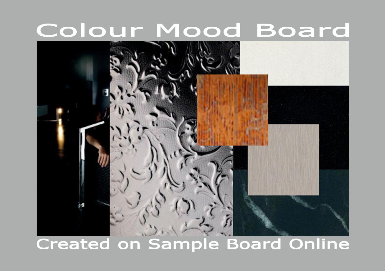
Sample Board Online is a brilliant tool for playing around with colour and creating colour schemes no matter what your design discipline.
In this blog are some examples of mood boards created on the Sample Board Online website. If you have followed the link from the article ‘Talking about tones: An easy way to create a colour scheme for your home’ I hope you find the boards helpful. Why not have a try all your need to do is create an account http://sampleboardonline.com and then just have some fun.
Business cards have been around for a long time. Some think the first business cards were used in China in the 1400’s. In 17th century Europe cards were used by the aristocracy and in London trade cards were used to adverise businesses. In France during the mid 1600’s and early 1700’s visiting cards were used with a system of set rules.
By the 1800’s calling cards were used by the middle and upper classes. In most homes silver trays were placed in the hall to receive the calling cards of visitors. Business cards became popular in the US in the 1890’s. Since this time some interesting business card etiquette has developed. For example in Asia it is considered rude to present a business card with the left hand. It is also thought rude to put the card away without reading it.
Cards should be kept in pristine condition. Most cards contain the name of the card holder, his/her title, the company address, telephone number, email address and fax number. In some instances the mobile telephone number and website address are added. The business address is not always placed on the card. Most cards also have a logo and a company tag line or slogan.
How to take more advantage of your business card
When handing a card to a person give them more than one. This means they can hand your card to someone they know who may be interested in your business
Make sure you give your cards to people to whom it would be relevant
It sometimes pays to give your card to a competitor. They could end up with too much business and send business your way
Take every opportunity you can to hand out your business cards
Plan strategically and set goals
The mistake most business people make is – not passing out enough cards. There is no wrong way to get your information out to people. Make sure you have an ample supply and just keep on handing them out. The key is the odds are in your favor the more you hand out the more likely you are to drum up more business.
In my last year at school many of my friends wanted to be secretaries. My best friend’s sister worked in London and was earning a very good salary as a secretary. My friend talked me into doing some night classes in shorthand and typing. I hated it and was dreadful at both. Instead of turning up at the classes I would sneak into the art classes. Alas my parents found out and my evening classes were abruptly stopped.
It amazes me now to think of those long ago days. If only I had learnt those skills I would have saved myself a lot of trouble. I never did learn to type as my Mum would say ‘the proper way’ In spite of the lack of professional skill I can type at a moderate speed. I did after all learn (asdf space ;lkj space) the first line and I am not a one finger typist.
These days there are very few secretaries around and many professionals need to write business letters. Over the years I have tried to develop my writing skills. I have completed many courses of study and been complemented on my writing. But I can still feel a wee bit inadequate and wish I had finished those classes many years ago.
I am always looking for ways to improve my writing so keep an eye out for informative books and websites. It is an ongoing process. I have also worked with others to help them improve their business letters and resumes. There has been a move away from the strict rules of yesteryear with the advent of advances in technology. However it is important to present a professional image and learn some tips and tricks for writing business letters.
Letters today need to be well crafted and concise. Job applicants are often advised to keep the covering letter of their resume to one page if possible. It is also a goal to aim at when writing bussiness letters. However the writer can often find they need to flow on to another page for the last few sentences.
Shaun from Writing Help Central has a few suggestions to help writers overcome this dilemma. He suggests moving the left and right margins by 0.25cm (1/4 inch) closer to the edge of the page. You could also move the top and bottom margins closer to the edge by 0.25cm (1/4 inch). The spacing between lines can also be adjusted. Instead of the usual single 12 points try 11 points.
Changing the font from 12 points to 11 points can also be a way of getting extra space. Often you will find you can get extra space by going back and doing some tough editing. Sentences with one or two words flowing over onto another line can often be reworked to eliminate the offending words.
Sometimes two page letters are the best option. If this is the case create a well spaced easy to read professional document and you will be forgiven for breaking what is now considered by many to be the cardinal rule ‘one page business letters please’.
The Art Deco era was considered a time of luxury, vitality, exuberance and decadence. At the same time eclectic styles and a move to modernism was evident. Historical sources as a starting point for new designs were used. Industrial methods and technological advances were also being used.
The most famous influence on modern design the Bauhaus was opened in Germany by Walter Gropius in 1919. This school of design combined architecture, industrial and graphic art.
The principles of William Morris and the Art and Craft movement were embraced. Fine art and practical craftsmanship were combined and the needs and influence of the modern industrial world were a major consideration. The International Style grew from these beginnings. The new profession of industrial design also developed at this time. Industrial design and Art Deco design led to streamlined designs of kitchens and bathrooms.
In the Scandinavian countries the ‘Swedish Modern’ and ‘Danish Modern’ styles appeared. Traditional craftsmanship and materials were honored and comfortable interiors and furniture the result. The work tended to be warm and avoided what some thought the cold appearance of modern designs.
Gunnar Asplund’s Senna Chair was designed in 1925 as was Bruno Matheson’s Extension Table. Both examples of Swedish design. Kaare Klint’s furniture and Mogens Koch’s folding furniture are examples of Danish design. The Finnish designer Eliel Saarinen’s interiors and furniture have strong Art Deco links.
The fireplace with mottled tiles, brass fire implements and the beautiful curved sideboard I nowrecognise as Art Deco. As a child I was unaware of how valuable (what I thought old and dated) were the furniture and accessories of my granny’s Irish home. Although the wallpaper and linoleum were often changed the old fireplace and Art Deco furniture and other pieces remained. I disliked the fireplace. This could be due to the fact I often had to clean out the ash, set the fire ready to light and go out into the cold night to get coal.
I now value the pieces of Art Deco and can appreciate the workmanship and design. My granny would have bought many of these pieces in the first years of her married life yet they were still there when we left Ireland for Australia in the 1970’s.
In the British home living rooms had the fireplace surrounded with pink, green or beige mottled matte tiles. Other colours used in the room were creams, eau-de-nil or oyster. The timber furniture tended to be pale and veneered in simple designs. Up lights, frames, mirrors and other items had stepped profiles.
The fabrics used in upholstery were plain or geometric. The linoleum floors had abstract designs or were black and white check. Parquet floors were also popular. In the 1920 UK magazine ‘Idea Home’ had an article on how to make large cushions in luxurious fabrics with tassels. Cushions in this style were the latest craze in the UK the article title; ‘The Indispensible Cushion: How to make them and where to place them’
Red and black tiles made by Carter & Co in Dorset England were designed with graphic linear motifs based on objects like fans and stylized flowers were also popular. The tiles were mottle matte eggshell glazes with random crackles and star burst effects and used to tile around fireplaces were also used for entire kitchens or bathrooms.
The bold geometric patterns and designs in the Hoover Building is a brilliant example of Art Deco design in the UK. The Hoover factory in Perivale West London was built in 1932 and designed by Wallis Gilbert and Partners and is a well know example of the Art Deco style in Britain.
One of the finest examples of Art Deco in the UK is Eltham Palace. If you go to this link http://www.english-heritage.org.uk/book-and-buy/venue-hire/eltham-palace/ you will find information and details on Eltham Palace built in the 1300’s. An Art Deco extension was commissioned in the 1930’s by the owners. The 15th century Great Hall was also restored. Art Deco the style went into decline about 1935. However there have been revivals in the 1960’s and 1970s.
After the success of the 1925 Paris exhibition the USA was greatly influenced by French Art Deco. The Americans loved the bright surfaces and abstract patterns of the style. The Art deco motifs of the rising sun and the stepped ziggurat became popular. At the 1933 World’s Fair ‘Century of Progress’ in Chicago the shapes and designs of Art Deco were prominent.
The skyscraper designs of the Chrysler building designed by William van Alen in 1930 had sleek aluminum-banded facades, arches and a pointed spire. Donald Deskey designed the interior of Radio City Music Hall built in 1931. The Empire State buildings is another example of this magnificent style. Ely Jacques Kahn designed Art Deco skyscraper entrance lobbies using brilliant colours and luxurious materials with the Art Deco motifs designs and shapes.
Large department stores and theaters had brilliantly coloured carpets with abstract designs. The US embraced the style and made it their own. In the home linoleum in the bold colours and designs of Art Deco ensured it would continue to be popular as did parquet floors. Zebra skin rugs and other animal skin rugs were in vogue and placed over plain wall to wall carpets.
In the USA Art Deco designs became more geometric and linear. This married well with the rise of the minimized modern design. Art Deco items could easily be mass production making the style available to the masses.
France was at the forefront of the Art Deco style for a number of years. Jacques Emile Ruhlmann in furniture, Jean Puiforcat in silver and Jean Dunand in lacquer work were leading designers at this time. Rene Lalique a glass worker and Paul Poiret a jeweler created beautiful pieces in the Art Deco Style.
The rooms of Ruhluman at the Paris exhibition of 1925 are brilliant examples of French Art Deco architecture. Rene Lalique created a shining example of Art Deco on the French luxury liner Normandie with his lighting and décor in the grand salon.
Ruhlmann used rare materials lizard skin, shagreen (sharkskin or galuchet), and ivory, tortoiseshell and exotic hardwoods. He created classically inspired interiors and furniture with Empire style features such as tapered fluted legs, drum shaped tables. He also used thin ivory inlays and delicate ivory caps (sabots) covered the feet.
At 1925 Paris exhibition the chairs placed in his dining room were based on the 18th century gondola type. He used boldly patterned wallpaper, a huge chandelier, classical detailing including; entablature as a cornice. Other French designers were Andre Groult and Paul Iribe. Paul designed an apartment in 1912 using 18th century design influences.
Groult used Louis XVI furniture and Art deco features. He createdformalisedbaskets, garlands of flowers, tassels, ropes and feathers. At Pavillion de L’Ambassade he created a female bedroom using shagreen furniture, bombe-shaped chest of drawers and a Gondole chair upholstered in velvet.
Eileen Gray designed Suzanne Talbot’s apartment in 1920. She used animal skins, upholstered an armchair in salmon pink with the two front legs modeled as two rearing serpents, a piroque (canoe) sofa in patinated bronze lacquer with silver-leaf decoration. The brick wall leading to the bedroom was lacquered.
She went on the open a shop to sell her hand made rugs and lacquer-work screens. In the late 1920’s she moved away from her highly decorative Art Deco work to embrace the Modern Movement using tubular steel, glass and timber furniture.
Unlike Eileen many Art Deco designers opposed the modern movement saying it neglected individuality and the decorative aspect of interior design.
The term Art Deco was coined to describe a style of interior design, architecture, textiles, ceramics and jewellery. Art Deco came to prominence in Paris at the 1925 Exposition Internationle des Arts Decoratifs et Industriels Modernes. The Art Deco period started in the early 1920’s and continued to be in fashion well into the 1930’s.
Characteristics of the style include symmetrical design with simple clean lines, sharp edges and stylishness. The words elegant, sophisticated and luxurious are words often used. Strong colours and straight designs were used as a reaction to the gentle pastel colours and flowing curving lines of the Art Nouveau. Chrome, enamel and highly polished stone were hallmarks of the era.
The motifs and patterns
Straight lines
Geometric shapes
Abstract patterns
Egyptian scarab
Sun Motifs
Stepped ziggurat shapes
Fan shapes
Aztec symbols
Stylised flowers
Sunrise motif
Egyptian
Cubism forms
Ancient Egyptian, Greek and classical patterns and motifs are also characteristic of Art Deco. The discovery and opening of Tutankhamun’s tomb in 1922 by Howard Carter brought Egyptian themes into vogue. Other influences were the Ballets Russes and Cubism. However designs, motifs and colours did vary between countries and the decades of the era.
The colours
Chocolate Brown
Black
Cream
Pale Yellow
Red
White on White
Buff
Beige
Coffee
Pink
Pastel blue
Pastel pink
Pale green
Exposition des Arts Decoratifs Paris 1925 colours
Ultramarine
Sea green
Deep blue
Turmeric yellow
Black
Crimson
Burnt orange
Hot pink
France started out as the center of the Art Deco movement. As mass production of Art Deco objects increased the people of the US embraced the style and became a dominant force and leaders of the Art Deco movement. Art Deco started to declined after 1935 but enjoyed a revival in the 1960s and 1970s. Some say we will see a revival of the Art Deco style in the 2000’s
I was very excited and proud to get this news; two Bendigo design projects have reached the finals of the Premier’s Design Awards for 2010. The Bendigo Bank’s ‘Bendigo Center’ and the Bendigo Art Gallery’s ‘Golden Age of Couture’.
This is a great achievement for a small regional city in the center of Victoria.
Bendigo and Adelaide Bank’s new headquarters, The Bendigo Centre, was officially opened by Prime Minister Kevin Rudd in 2008. The building houses offices, shops and cafes. About 1,000 Bendigo Bank staff work in the 5 Green Star building. It is one of the first to be built in a regional city.
Many Green Features
A number of environmental features and benefits have been included by the designers of the building. The green features include under-floor air conditioning, solar panels to reduce black power usage and exterior sunshades to reduce heat.
It is estimated the building will consume less than half the energy of a typical office building. Cut greenhouse gas emissions by 820 tonnes each year - the equivalent of removing 190 cars from Bendigo’s roads.
Water Conservation
Another important feature is the water conservation water-efficient fixtures and fittings and a recycling water plant treat all black and greywater to Grade A standard for toilet flushing to ensure minimal use. The surplus recycled water will be distributed throughout the Bendigo community and for garden use. Rainwater is collected from the roof area, filtered, stored and reused in the drip-fed irrigation system that supplies the landscaped gardens at the front of the building.
Under -Floor Displacement Air Conditioning
One of the first large-scale applications of under-floor displacement air conditioning in Australia has been include in the design. This system provides fresh, clean air at a low pressure with individual vent controls at every workstation. The result is 50% improvement in fresh air rates by Australian standards and ensures increased staff health, effectiveness and productivity.
Community Focus
Bendigo Bank started its life as a building society in the Victorian gold rush of 1800’s. From the start the philosophy of the company has been to help the community. Many gold widows were left in Bendigo during the gold mining period. Men died of a miner related lung disease. The society helped families in numerous ways during this time.
The bank is also famous for the community support given to isolated communities. When other banks left an area Bendigo bank moved in to help create a community bank (run by the community) under the umbrella of the Bendigo Bank
The Bendigo Bank building has had its fair share of controversy. The ultra modern design has been felt by some to spoil the historic aspect of the city’s historic buildings. I have always preferred modern architecture but I must admit I struggled as the modern building started to emerge above the historic streetscape.
I am so impressed with the environmentally sustainable features of the building but I am still coming to terms with the clash of architectural styles. My problem is I love the building design. But it does impact on the period architecture of the city. Only time will tell; will the building eventually become accepted for what it is a building of the time.